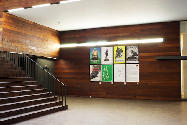
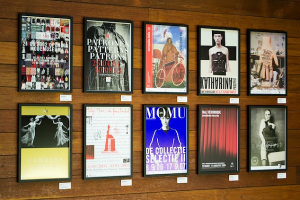
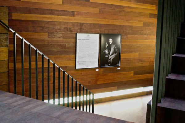
This year we celebrate the 10th anniversary of MoMu. Ten years of the MoMu Fashion Museum: that means twenty major theme-based or designer exhibitions and countless other projects in and outside the ModeNatie building. Time and again, fashion designers, photographers, exhibition designers, artists, performers and the entire MoMu team have worked on yet another new story. In total, these MoMu exhibitions were visited by more than 800.000 people. Because it is always rewarding to take a look back when a new period is beginning, the MoMu is exhibiting the 20 posters for these exhibitions in the entrance hall until December 2nd.
MoMu exhibition posters in the entrance hall, 2012, Photo: MoMu
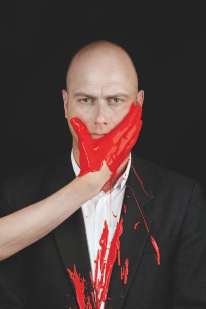
We sat down with graphic artist Paul Boudens, who designed almost all the posters in the installation.
Portrait Paul Boudens, Photo: Ronald Stoops
How does it feel to see your work come together at MoMu?
Ten years went by so fast… I see my life flash by with 200 kilometres per hour (laughs)!
How did the collaboration between MoMu and you start?
I sort of rolled into it. I was already designing posters for the Antwerp Fashion Department and working with Walter Van Beirendonck during my graphic design studies in the late eighties. Also, I already knew Linda Loppa, who was teaching at the Academy at that time. Then in 2001, I was working on Fashion 2001Landed-Geland (a city project around fashion, [red.]) and A Magazine. The MoMu in a way rolled out of these projects. The next year, Linda (then director of ModeNatie [red.]) asked me to design the MoMu housestyle, and the catalogue and poster for the opening exhibition Selection I: Backstage. And suddenly we’re ten years later.
MoMu exhibition posters in the entrance hall, 2012, Photo: MoMu
How do you design a poster for MoMu?
Usually, the museum provides me with a couple of images — for use or inspiration — if they have any. Sometimes the design process goes really fast, other times it can take weeks. After all, the campaign image is the starting point for the rest of the designs: books, invitation, brochures, etc. Although I am not working at the museum, the entire process is a collaboration with the team. I like to know about the scenography in advance, to get a true feel of the subject matter. Anyway, I do not like a job that is too easy, I like a bit of a challenge.
MoMu exhibition posters in the entrance hall, 2012, Photo: MoMu
Do you have any personal favourites and why those?
All of them are my babies! How can I choose between them? Some of them are better than others, but if I have to pinpoint the highlights, they would be Patterns, 6+ Antwerp Fashion, Yohji Yamamoto – Dreamshop and Black. I like them because they are very pure and simple: less is more, always.
Next to MoMu you are working on other projects as well, can you give a few examples of those?
I like to design anything really. In the last decades I have been working with and for fashion designers Walter Van Beirendonck, Jurgi Persoons, Olivier Theyskens, Haider Ackermann and Yohji Yamamoto. I worked on A Magazine for ten years, and lately I’ve been designing a lot of books, the last one was Interior Life for Gert Voorjans. His style is very abundant and I am generally more minimalist in my aesthetic, so that was a great challenge!
You have designed the house style of MoMu, why did you choose red and what is the story behind the logo?
I have a thing for red. Red is also the colour of the City of Antwerp. Also, one of my early influences was Bauhaus, in which primary colours are always used. I also took inspiration from the cigarette brand I was smoking at the time. Inspiration is everywhere. (laughs)
But red is the love of my life, so to say. I use other colours too though. (laughs)

